
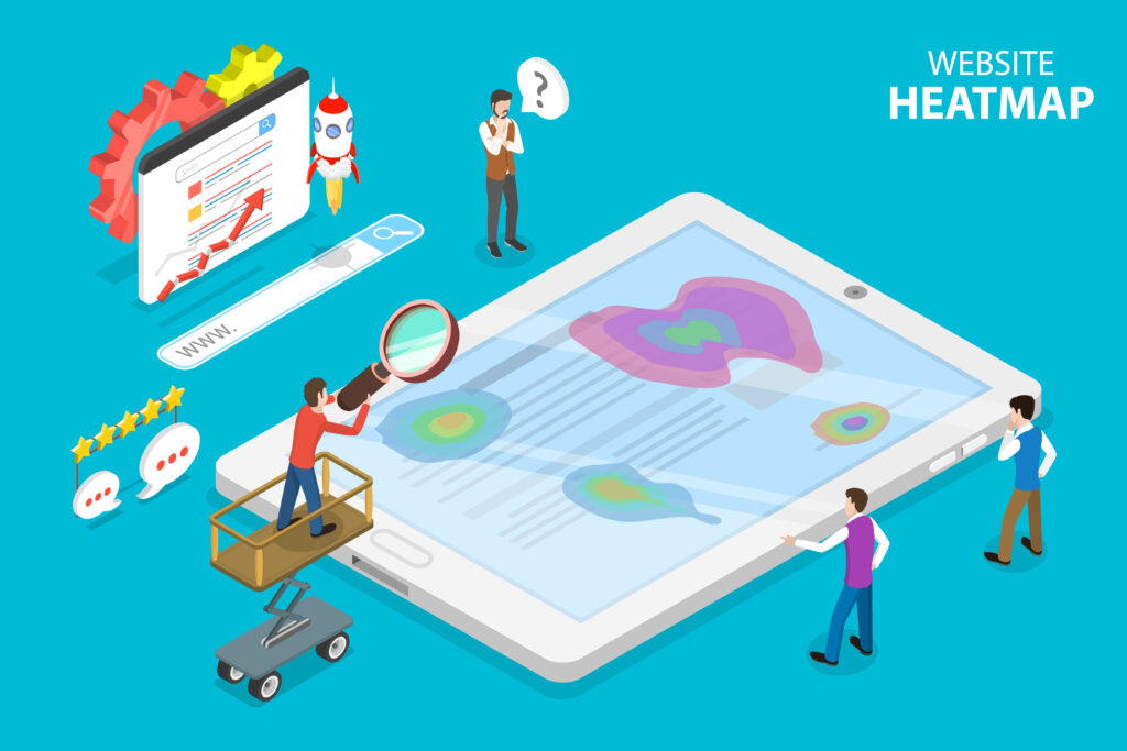
A heatmap is a conversion rate optimization tool that visualizes user interactions on a website. This data can be used to understand what users are doing on a site, where they are struggling, and how to improve the user experience. Heatmaps can be used to track mouse movement, clicks, scrolling, and attention. There are different types of heatmaps, including click heatmaps, scroll heatmaps, and attention heatmaps.
Reading and understanding heatmaps can be tricky, but there are a few key things to look for. First, identify any areas of the page that are getting a lot of attention. These areas may be good candidates for conversion optimization. Second, look for areas of the page that are not getting much attention. These areas may need to be redesigned or removed. Finally, look for any patterns in user behavior. For example, if users are constantly clicking on the wrong thing, that may be a sign that the design needs to be improved. This information can be used to improve the user experience and conversion rate. By understanding how users interact with a website, it opens the door to make changes that improve the user experience.
When reading a heatmap, it is important to look for patterns and trends. Heatmaps can be used to identify areas of a website that are getting attention and areas that are being ignored. They can also be used to find conversion rate optimization opportunities. For example, if a heatmap shows that users are not scrolling to the bottom of a page, that may be an indication that the content on that page is not relevant or interesting to them. Additionally, if a heatmap shows that users are clicking on a particular element on a page, that may be an indication that that element is confusing or unclear.
To read a heatmap, you’ll want to look at the areas that are getting the most interaction. The hot spots are usually where users are struggling or finding difficulty. You can use this information to improve the user experience by making changes to the design or content of your site. Improving your overall conversion rate begins with identifying these kinds of pitfalls and barriers that are preventing your site traffic from converting into paid customers, and heatmaps are a valuable resource when it comes to identifying these roadblocks.
When used incorrectly, heatmaps can be misleading. Overlaying conversion data on top of a heatmap, for example, will show you where people click after they have converted. This might be useful to understand what kind of post-conversion behavior is happening on your site, but it will not help you understand why someone did or did not convert on your site. In order to get actionable insights from your heatmaps, you need to make sure you are looking at the right data.
When analyzing heatmaps, it is important to remember that they are a conversion rate optimization tool and not a user experience tool. While heatmaps can be used to improve the user experience, they should not be used as the sole method for doing so. User experience is about understanding how people use your site and making changes based on that understanding. conversion rate optimization is about making changes to your site to increase the number of people who take a desired action.
Both user experience and conversion rate optimization are important, but they are two different things. Heatmaps can be a valuable tool for conversion rate optimization, but they should not be used as the only method for improving the user experience. If you want to improve the user experience of your site, make sure to use other methods in addition to heatmaps.